Alexander Shorokhoff is among my favorite watch brands, so it’s no surprise that AS watches are regular guests in my reviews. At the moment, besides the one I’m going to present today, another is still on my waiting list, patiently awaiting my free time for a review...
Today’s watch is—in my opinion—one of the most interesting AS models from the Avangarde collection, called Levels. The AS logo stands for “Art on the Wrist,” and the basic idea is that a watch is not just a device to show time but should be a piece of art. Often, Mr. Shorokhoff’s ideas about the artistic elements on the watch are a bit too kitschy for my taste, but that’s not the case with the Levels collection.
The first two versions of the Levels model (blue and white dials) were released back in 2020. The blue version was awarded the German Design Award in 2021. Earlier this year, two additional versions were introduced—brown and grey. I decided to buy the grey one.
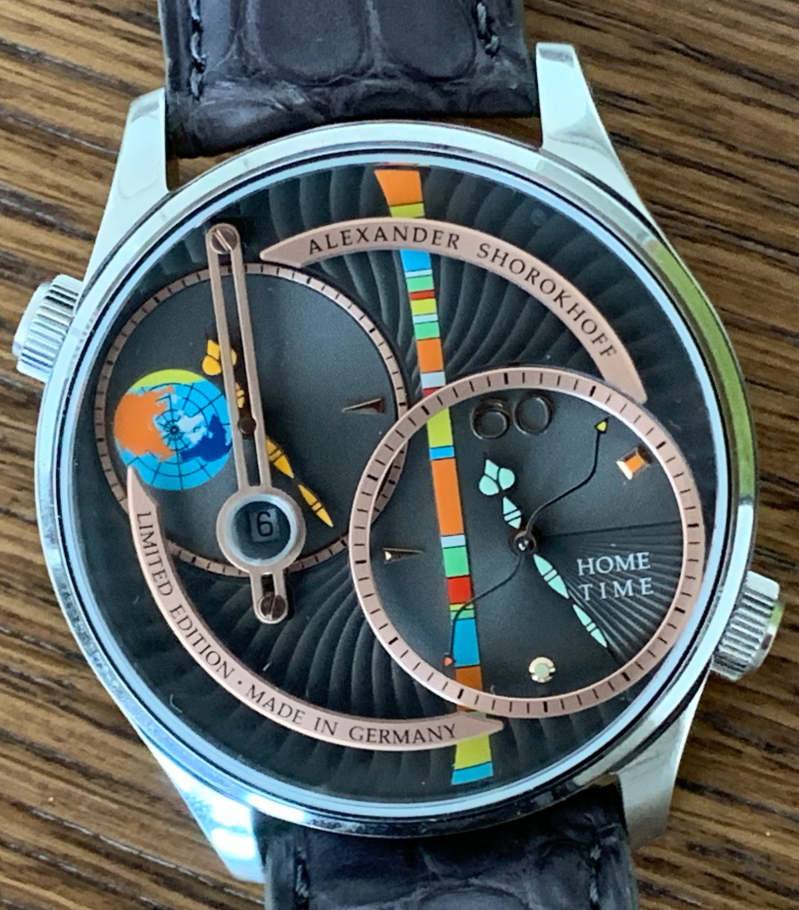
The basic concept behind all four models is a dial built in several layers—levels—making the dial truly a full 3D experience. What exactly does that mean? There are four different heights where dial elements are placed. On the ground floor—the first level—is the dial for the away-time watch. On the second level is the “Alexander Shorokhoff” logo. The third level holds the home-time watch. It’s important to note that, in fact, both watches are on the same ground level, but the “bezels” surrounding each are at different heights. Finally, on the fourth level, you’ll find the “limited edition” sign. These levels are hard to see from a straight-on photo, so I tried to capture them from the top and left side of the watch.


The basic dial plate features a guilloché style, and each “subdial,” or rather each watch, has its own unique details. The right watch is designated as the “home time,” while the “away time” is indicated by a small Earth symbol. The home time watch includes a very elegant seconds hand, whereas the away time watch does not have a seconds hand at all. One particularly interesting feature is the construction of the date window—which is only present on the away time watch. A magnifying glass is positioned on an elevated “bridge” at the highest level of the dial. This magnifier is not embedded directly into the sapphire crystal of the watch front but sits just beneath it.
The final touch on the dial is a colored stripe, which gives the watch its distinctive “Alexander Shorokhoff design.” The large ‘60’ on the home time watch and the shape of all the hands perfectly align with the aesthetic of the Avangarde collection.

The basic gray color of the dial leans more toward brown than true gray, and combined with the rose gold tones of the levels, it gives the watch a phenomenal look in person. With all the layered elements and color contrasts, this watch is truly an eye-catcher!
With that, I’ll conclude my impressions of the watch’s “artistic” side. Now, it’s time to shift focus to the technical and practical aspects of the watch.

First, the watch is quite large. Its diameter measures 46.5 mm without the crowns. Since the watch has no bezel and the dial extends almost to the very edge of the case (the dial itself is 43 mm in diameter), it also appears quite big visually. Fortunately, the 24 mm lugs help balance this by allowing a wide strap that visually reduces the watch’s presence. Still, a larger wrist is necessary to wear this comfortably. Despite the layered dial, the height is under 13 mm, and with a lug-to-lug length of 50.7 mm plus the diagonal crown placement, the watch remains surprisingly wearable.
The size is quite logical, considering the dual time complication. To achieve this, Alexander Shorokhoff chose to use two independent ETA 2671 automatic movements, which were refined and hand-engraved by AS.

Even though the ETA 2671 movement is quite small, it’s difficult to make a watch smaller than 46 mm if you want to fit two movements side by side.
What about the user experience? Well, one thing really bothers me: the so-called away dial is very hard to read. The date bridge—which is attractive on its own—unfortunately covers a large part of the dial. Because the hands and the bridge share a similar color, reading the time becomes quite difficult whenever the minute hand is in the 25–35 or 55–05 minute intervals. The same issue occurs when the hour hand is between 11–13 or 17–19 hours. Since the away time should represent your current local time, that dial is usually more important than the home time dial. For that reason, I would suggest swapping their functions—use the home time dial as local time, and the away dial for home time.
Another problematic aspect is the date window. The ETA 2671 is a small movement, so the date ring does not allow for large date numbers. The magnifying glass above the date is a logical solution. However, this magnifier is placed beneath the sapphire glass and circled by the elevated bridge, which means you can only clearly see the date when looking straight down at the watch. You can’t just glance quickly; you have to adjust the angle precisely to read the date.
I’m also surprised the date appears only on the away time zone (even though both movements are identical and support a date complication). Since home and away dates can differ—especially for frequent travelers—it can get confusing whether your home date is ahead or behind your local date. If you follow my suggestion and swap the dials, having the date only on the away dial becomes even more inconvenient. But clearly, limiting the watch to just one date and one second hand was a conscious design choice to keep the dial from becoming too cluttered.
Both time zones have luminescent hands, but the lume quality is underwhelming. The home dial has noticeably better night visibility than the away dial—another reason to swap their roles in practice.

The case is made of brushed and polished steel, and all crystals are sapphire. The watch comes on a very good crocodile leather strap with a signed pin buckle that perfectly matches the dial color—at least in my specific case, the grey dial version.
Each dial version of the watch is limited to 99 pieces. The first two versions issued are almost sold out now, though a few last pieces can still be found. Each watch is individually numbered on the case back.
The watch is delivered in the standard Alexander Shorokhoff box, which I have already shown in my other AS reviews, so no need to repeat it here.
What about the price? AS is not a cheap brand, so this watch isn’t cheap either. The official EU price for all four models is 3590 EUR. With some luck, I was able to acquire mine for 3200 EUR. Still a significant amount, but considering the hand craftsmanship involved in assembling a watch like this, I find it fair.
I also want to mention that I purchased the watch in Slovakia from the shop www.watchexclusive.eu. A very positive experience—if you plan to buy any AS watch, I highly recommend checking out this store. They are an official AS dealer, so you will receive all the proper stamps, warranty cards, and documentation.
Final verdict: This is a real eye-catcher that offers a lot of enjoyment to wear. However, if you regularly need to track two time zones or rely on that functionality, think carefully about which dial you will assign to each zone. Even more importantly, reconsider whether this watch is truly the right choice for you. Keep in mind that the artistic design and visual impact take precedence over the practical dual time zone functionality.
Add comment
Comments